Understanding the Meaning of Colour
Colour is a powerful communication tool that influences how we perceive the world around us. Beyond its aesthetic appeal, each colour carries its own unique meaning and can evoke a wide range of emotions and associations.
Let's explore the significance of different colours and how they can be used to convey your message effectively.
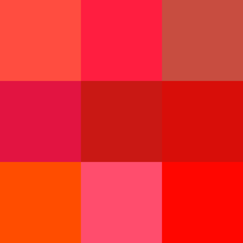
Red: Passion, Energy, and Action
Red is a colour that commands attention. It is often associated with passion, energy, and excitement. Red can evoke feelings of warmth, intensity, and urgency. It is frequently used to convey a sense of action, making it an ideal choice for brands looking to stand out and make a bold statement.

Blue: Trust, Stability, and Serenity
Blue is a calming and reassuring colour that is often associated with trust, stability, and reliability. It has a tranquil and serene quality that can evoke feelings of peace and clarity. Blue is commonly used by brands that want to convey a sense of professionalism and integrity, making it a popular choice in industries such as finance, healthcare, and technology.

Yellow: Optimism, Happiness, and Creativity
Yellow is a vibrant and cheerful colour that is often associated with optimism, happiness, and creativity. It has a bright and uplifting quality that can evoke feelings of joy and positivity. Yellow is commonly used by brands that want to convey a sense of warmth and friendliness, making it an ideal choice for businesses in the hospitality, entertainment, and food industries.

Green: Growth, Harmony, and Renewal
Green is a colour that is often associated with growth, harmony, and renewal. It has a calming and refreshing quality that can evoke feelings of balance and tranquility. Green is commonly used by brands that want to convey a sense of environmental consciousness and sustainability, making it a popular choice for eco-friendly and organic products.

Purple: Luxury, Royalty, and Wisdom
Purple is a colour that is often associated with luxury, royalty, and wisdom. It has a regal and sophisticated quality that can evoke feelings of elegance and prestige. Purple is commonly used by brands that want to convey a sense of exclusivity and sophistication, making it a popular choice for high-end products and services.

Orange: Energy, Creativity, and Enthusiasm
Orange is a vibrant and energetic colour that is often associated with energy, creativity, and enthusiasm. It has a dynamic and invigorating quality that can evoke feelings of excitement and vitality. Orange is commonly used by brands that want to stand out and make a bold statement, making it an ideal choice for businesses in the fashion, sports, and entertainment industries.

Black: Power, Sophistication, and Mystery
Black is a colour that is often associated with power, sophistication, and mystery. It has a timeless and elegant quality that can evoke feelings of strength and authority. Black is commonly used by brands that want to convey a sense of luxury and exclusivity, making it a popular choice for high-end fashion, automotive, and technology brands.

White: Purity, Simplicity, and Clarity
White is a colour that is often associated with purity, simplicity, and clarity. It has a clean and minimalist quality that can evoke feelings of cleanliness and openness. White is commonly used by brands that want to convey a sense of simplicity and sophistication, making it an ideal choice for businesses in the healthcare, beauty, and technology industries.
Cultural meanings
Colour can have significantly different meanings for people and cultures, and we need to be aware of that – white is pure and positive in Western European cultures, but in China white is used in mourning, symbolizing heaven.
We need to consider our audience when we are designing with colour.
David McCandless has created a wonderful infographic showing what colours mean in different cultures (see image below).
Colours in Culture by David McCandless, from https://informationisbeautiful.net/visualizations/colours-in-cultures/
We need to consider our audiences when we are using colour. We need to make sure we are not offending anyone, or conveying a meaning that you don’t intend.
Depending on our audience, we can also make use of colour conventions as a form of shorthand in our communications – like red being a negative trend, or green showing growth (but never in the same graphic, because of colour blindness).
Using colour in design
Understanding the meaning of colour is essential when designing logos, websites, marketing materials, and other visual elements for your brand. By carefully selecting and combining colours, you can effectively communicate your brand's personality, values, and message to your target audience. Whether you're aiming to evoke a sense of passion, trust, optimism, growth, luxury, energy, power, or purity, the right choice of colour can help you achieve your goals and leave a lasting impression on your audience.
Let us help you
At Bucketduck Inc, we specialize in creating visually stunning and impactful designs that leverage the power of colour to communicate your message effectively. Whether you're looking to refresh your brand identity, create a new website, or develop marketing materials that resonate with your audience, our team of experienced designers is here to help.
Contact us today to learn more about our services and how we can help you harness the power of colour to elevate your brand.
