Choose your fonts wisely
Fonts have a high impact on user experience, and your site identity.
Not all fonts are created equal — some are easier to read than others. Fonts have traits that affect recognition of individual letters and words, and can help us process content faster. When we read, we recognize the shape of familiar words as we’re reading, rather than processing each single letter to make up a phonetic group. So the more legible and ‘readable’ the font is, the quicker and easier it is to process the text. Very few viewers will read through a full paragraph of text, most will skim for key words.
It’s legibility doesn’t make it a bad font, it just might not be suited to certain tasks. For example, a really stylized handwriting style font wouldn’t be suitable for long paragraphs of text, but for headlines it might help convey tone and personality.
Using unique-looking fonts on websites has become really easy, but “just because you can doesn’t mean you should”. Keep difficult-to-read fonts (like handwriting or ornate fonts) to a minimum, for things like one heading per page. It becomes overwhelming if they are overused.

Serif vs. sans serif
There has been a lot of debate about what is better for readability, without really conclusive results.
A serif is a small line attached to the end of a stroke in a letter. A typeface without serifs is called sans-serif, from the French sans, meaning “without”.
Some prefer serif for large bodies of text, as the appendages are thought to help lead the eye through the text, and help with letter recognition (particularily between uppercase i and lowercase l).
But on the flip side, some say sans-serif has a cleaner appearance, making it easier to read.
It really comes down to preference, you can’t go wrong with a well designed version of either.

Ubiquitous fonts
Conventional serif fonts for the web are Times New Roman and Georgia, and conventional sans-serif fonts are Arial, Tahoma, or Verdana. These are shipped on all hardware, so they are pretty much guaranteed to work in every browser.

Web fonts
But if you want something a bit different, a bit more unique, you can also use web-fonts on your websites, these are non-standard fonts that are hosted online, like at Google Fonts (fonts.google.com).
Hosted platforms like Squarespace have a large font-library that you can use, at the click of a button. Or if you have a self-hosted site like Wordpress, a programmer can set up a style sheet that uses specific web-fonts. Google Fonts are free, but there are other providers like myFonts.com that have a larger library, but are not free.
Font sizing
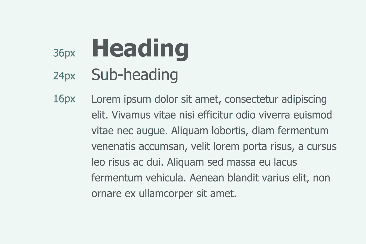
When we’re deciding on font sizes, we generally start with the body text size and scale up from there for sub-headings and headings.
For example, it has become an industry standard to use 16px for body text online, to maintain readability. As a guideline, we can generally scale up 1.5 to 2 times for each style larger.
So if body text is 16px, a subheading could be 24-32px. A heading could be 36px-64px.
It all depends on what you are designing, and the space that you have to work with. On a desktop screen, you can go larger, but on a phone screen, you might not want to go quite so large. It can be subjective, and it ultimately comes down to personal judgement.

Readability and line length
As a general rule, we should use between 50-75 characters per line, for comfortable reading. This is a good rule for both print and digital.
If a text block is too wide (like the top example above) our eyes have a hard time focusing on the text and continuing onto lines below.
And if a block is too narrow (like the bottom example) the eye has to travel back and forth too often, which can break the reader’s rhythm.
In web design, we can restrict the width of text blocks, and setting a maximum width is very important for responsive design, so text doesn’t expand exponentially.