Use colour with intention
Colour plays a huge part in visual identity.
Colour is subjective. We each have personal connections to certain colours. Colour has the ability to guide, direct, and persuade us. It can appeal to our emotions, and set the mood or tone. But too many colors or fonts onscreen can be overwhelming and counterproductive. Choose your colours carefully.
Cultural meanings
Colour can have significantly different meanings for people and cultures, and we need to be aware of that -- white is pure and positive in Western European cultures, but in China white is used in mourning, symbolizing heaven.
We need to consider our audience when we are designing with colour.
David McCandless has created a wonderful infographic showing what colours mean in different cultures (see image below).

Colours in Culture by David McCandless, from https://informationisbeautiful.net/visualizations/colours-in-cultures/
We need to consider our audiences when we are using colour. We need to make sure we are not offending anyone, or conveying a meaning that you don’t intend.
Depending on our audience, we can also make use of colour conventions as a form of shorthand in our communications – like red being a negative trend, or green showing growth (but never in the same graphic, because of colour blindness).
Colour Spectrums
There are different spectrums of colour that we’re dealing with — RGB and CMYK.
RGB: Colours on a monitor are made up of the additive spectrum (red, green, blue -- RGB), and all three create white when added together.
CMYK: Printing uses a subtractive process (cyan, magenta, yellow and black -- CMYK), and when added together these create black.
RGB has a wider range of hues (including electric, bright colours) and converting to CMYK can result in murky colours.
For example, if you’ve ever created something colourful (bright, electric colours) in Word, and then tried printing it on a colour printer, the colours look duller in print than on screen. This is because Word uses RGB colour, but printers use CMYK.
On the flip side of that, if you design in CMYK but only view it onscreen, you might not be achieving as vibrant a colouras you could, if you used an RGB equivalent.
The best way to manage colour is to have a base set of Pantone colours to start with, and define the closest equivalents for that colour in CMYK and RGB or hex.
Pantone is a standardized colour matching system, so that designers and printers can reference a colour and have it replicated to the exact formula.
We need to be aware of spectrums, and the mediums that our communications are going to be used or consumed in, before we begin designing.

RGB = additive spectrum

CMYK = subtractive spectrum
Properties of colour
Contrast increases readability and legibility. There are three main properties of colour that we can adjust to create contrast:
the hue (colour)
the value (darkness or lightness),
and the saturation (vibrancy).

Hue
When we’re deciding what colours to use, we can look at contrasts in hue.
Complementary colours: Pairs of colours that are opposite each other on the colour wheel. When placed next to each other, they create the strongest contrast and the most vibrant combination. Examples of complementary colors include red and green, blue and orange, and yellow and purple.
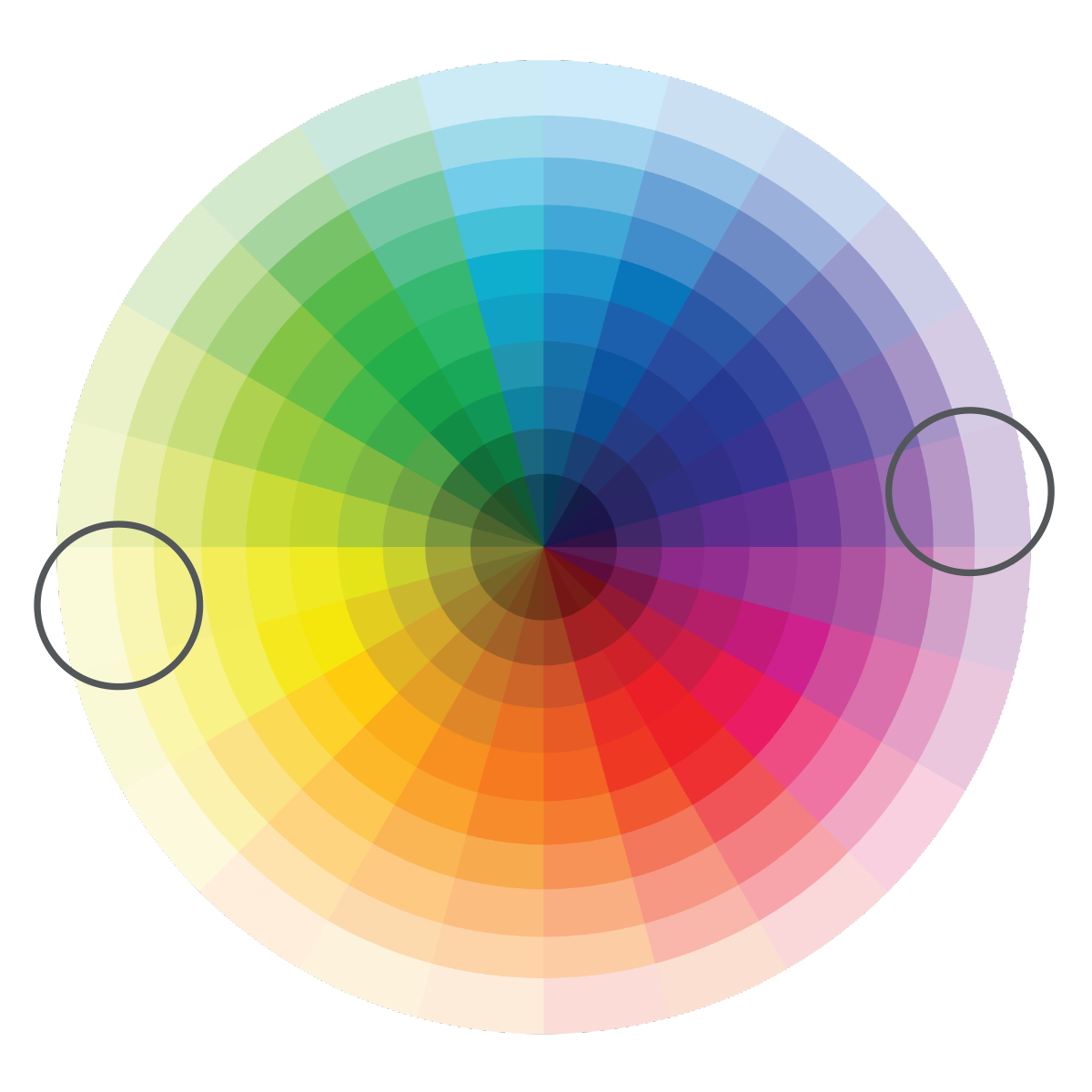
Complementary colours are opposites on the colour wheel.
Analogous colours: Groups of colours that are adjacent to each other on the colour wheel. They share similar undertones and often harmonize well together. Analogous color schemes create a sense of unity and cohesion in design. For instance, a combination of blue, green, and teal is an analogous color scheme.
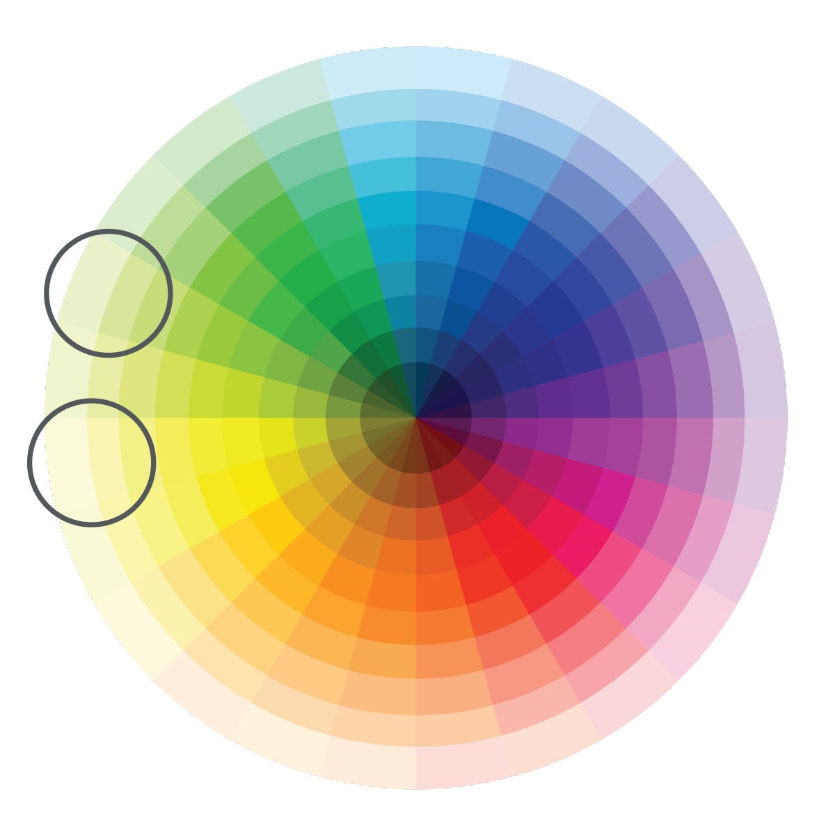
Analogous colours are side-by-side on the colour wheel.
In summary, complementary colors provide high contrast and intensity, while analogous colors offer harmony and unity in design. Both concepts are essential for creating visually appealing compositions in art, design, and other creative fields.
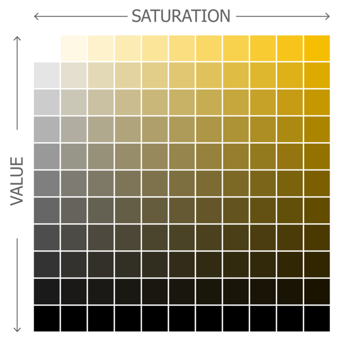
Value and Saturation
Contrast in value: the relative lightness or darkness of a colour. Can also be referred to as brightness.
Contrast in saturation and intensity: saturation refers to purity of hue. Pure, saturated colours are bright. Can be modified by adding white (tints) or black (shades).
Intensity can be changed by adding part of it’s complement. Mixing complementary colours results in neutrals.
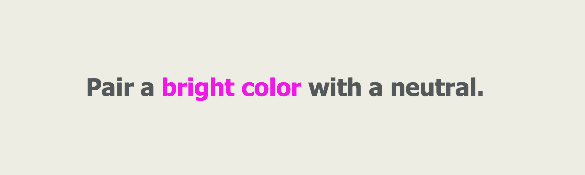
Tips for contrast
Pair a bright colour with a neutral
You can get great contrast when pairing a bright colour with a neutral, for example.
Dramatic contrasts make elements more legible.
A contrast of at least 70% is recommended. You could check your value of contrast by turning your monitor to greyscale. Or, an easier way is to squint at it. Squint so that you’re just barely seeing it, and that helps to see your contrast. If you can still see your letter forms, there is enough contrast.

Simultaneous contrast
Complementary colours that have the same value (lightness/darkness) can create simultaneous contrast, which causes eye strain, so those should be avoided.

Colour conventions
The immediacy with which colour is recognized makes it valuable for forming clear relationships — for example, in early web design all links were blue. Or if you’ve entered something on a form that is incorrect or wrong it might be indicated in red.
Assign things like links or buttons (items that have actions associated with them) a contrasting color, so that it stands out as something that can be interacted with. It’s a visual cue.
As long as you’re consistent with how you apply colour, links and buttons can be any colour. But keep in mind that people have pre-conceived expectations of colour – green is good, red is bad (but those shouldn’t be used together, because of colour blindness).

Colour blindness
It’s estimated that 15-20% of individuals will exhibit some kind of colour-vision deficiency (and in men more likely than in women). Don’t use red and green together; alternatives can be blue for positive, and orange for negative.
Our vision deteriorates as we age; differentiation of colour becomes an issue. Physically, we all have different numbers of rods and cones in our eyes that may affect colour recognition. So contrast is very important, regardless of colour.
Other factors that affect colour
Digital equipment: Monitors display colours differently (calibration, brightness), and luminosity affects colour pairings.
Printing factors: In print, paper stocks absorb ink differently, affecting colour (factoring in the hue of the paper, a coated or uncoated stock, and finishes like varnish)
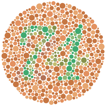
Example of an Ishihara color test plate. Viewers with normal color vision should clearly see the number "74". From Wikipedia at https://en.wikipedia.org/wiki/Color_blindness
Colour summary
Like-colours mean like-items. Use colour with intention.
A change in colours signals a change, so use colours with caution. Don’t add or change colours just for the sake of novelty.
If every variable gets a bright colour, no one variable stands out.
When everything is highlighted, nothing is highlighted.
Consider your colour palette, and use a minimum number of different colours consistently throughout the site.
If you’d like some help with colour, contact us — we’d love to help!